Brand Guidelines
How the Pleny identity is built, and how to use it: the logo, our colours, our typefaces, the pattern, and the rules that keep every piece looking like Pleny.

Logo
Logo Concept
The logo is based on a wordmark approach, in a bold style. It feels friendly, youthful, and modern with a nice flow and rhythm.
The Wordmark
The Icon
The Exclusion Zone
The Exclusion Zone ensures the legibility and impact of the Logo by isolating it from competing visual elements such as text and supporting graphics.
This zone should be considered as the absolute minimum safe distance; in most cases the Logo should be given even more room to breathe.
The exclusion zone of the Logo is equal to the width and height of the letter e.
The exclusion zone of the Mark is equal to one third the height of the letter P.
Wordmark exclusion zone
Icon exclusion zone
Minimum Sizes
Establishing a minimum size ensures that the impact and legibility of the Logo is not compromised in application. Due to the higher resolution available in print vs that of screen based media (300dpi vs 72dpi respectively), we are able to reproduce the Logo at a fractionally smaller size in print without any graphic deterioration.
Digital
To ensure legibility and impact, the Pleny Logo should never be reproduced smaller than 70px wide in any digital communication.
To ensure legibility and impact, the Pleny Logo should never be reproduced smaller than 20mm wide in any print communication.
Wordmark minimum sizes
- Digital
- 70px
- 20mm
Icon minimum sizes
- Digital
- 25px
- 8mm
Logo Color Options
The Pleny Logo is our primary visual, and must always be used in the Purple color. This elevates the brand blueish purple from the rest of the palette, ensuring that it is not confused, nor its power diluted.
The Pleny Purple Logo should only be used with Black, White, and the specified secondary colors shown in the Colors chapter.
If color is not an option for technical reasons, or if the brand purple lacks contrast or competes with other visual elements, you have permission to use either the black or white Logo options.
Purple Logo Options
Mono Logo Options
Logo Placement
Regardless of communication size or dimension, the Logo can only ever be placed in five locations. This keeps Logo placement simple and consistent, while allowing enough flexibility to accommodate our dynamic graphic system. Please keep in mind the Logo exclusion zone when placing the Logo in a corner.
In no particular order, the placement options are:
- 1.Top left corner
- 2.Top right corner
- 3.Centered
- 4.Bottom left corner
- 5.Bottom right corner
The five positions
The Logo in place
Colors
Primary Colors
Color is highly communicative and plays an important role within our identity. A range of curated colours are available which can be used to communicate in a wide range of tones. A consistency in approach to colour is integral.
Our Primary color should be used mainly for backgrounds, color fields and other graphic devices including brochure covers, page dividers, promotional folders and so on.
Tints and shades · click any swatch to copy its hex
Secondary Colors
The secondary colors should always be paired with the primary palette and should only be used in scenarios where the primary palette cannot be used.
Color Combinations
The default version of the Pleny logo uses our primary brand color Purple. However, the logo can live with different colors.
Here, you will find an overview of possible color combinations.
Typography
Typeface 01
Typography plays a critical role in establishing a unified personality and plays a large role in our visual identity. For this reason, we have chosen Poppins.
Poppins
Alphabet
Aa Bb Cc Dd Ee Ff Gg Hh Ii Jj Kk Ll Mm Nn Oo Pp Qq Rr Ss Tt Uu Vv Ww Xx Yy Zz
Numerals & symbols
0123456789!@#$%^&*()_-+=
Weights
Typeface 02
Vollkorn is our secondary typeface. It carries paragraph headings, where the contrast of a serif gives long-form copy a clear entry point alongside Poppins.
Vollkorn
Alphabet
Aa Bb Cc Dd Ee Ff Gg Hh Ii Jj Kk Ll Mm Nn Oo Pp Qq Rr Ss Tt Uu Vv Ww Xx Yy Zz
Numerals & symbols
0123456789!@#$%^&*()_-+=
Weights
Typography System
- 1. Heading
- Poppins Bold
Size: 70
Leading: 80
Tracking: 0 - 2. Sub-Heading
- Poppins Medium
Size: 20
Leading: 24
Tracking: -15 - 3. Paragraph Heading
- Vollkorn Bold
Size: 24
Leading: 28
Tracking: 0 - 4. Body Copy
- Poppins Medium
Size: 14
Leading: 19
Tracking: -15
Main Heading
Pleny is your new home for all things social: find the places worth eating at, share the moments worth sharing, and meet the people who eat like you do.
Paragraph Heading
Body copy carries the detail. Set it in Poppins Medium and keep the measure short enough to read comfortably on a phone. Four levels are enough for almost any layout: a heading to open, a sub-heading to frame it, a paragraph heading to break up length, and body copy to do the work. Use them in that order and the page will hold together without any extra decoration.
Typeface 03
Noto Kufi Arabic carries the identity into Arabic. Its geometry and weight range match Poppins, so bilingual layouts stay balanced.
Noto Kufi Arabic
Alphabet
أ ب ت ث ج ح خ د ذ ر ز س ش ص ض ط ظ ع غ ف ق ك ل م ن هـ و ي
Numerals & symbols
٠١٢٣٤٥٦٧٨٩
Weights
Logo Misuse
Logo Misuse
It is important that the appearance of the Logo remains consistent.
The Logo should not be misinterpreted, modified, or added to. No attempt should be made to alter the Logo in any way. Its orientation, colour and composition should remain as indicated in this document — there are no exceptions.
To illustrate this point, some of the more likely mistakes are shown here.
Do not apply a gradient to the Wordmark.
Do not distort or warp the Logo in any way.
Do not outline or create a keyline around the Logo.
Do not change the Logo colour or tone outside those colours specified in the colour section of this guide.
Do not rotate the Logo.
Do not change the typeface or otherwise recreate the Wordmark. Use only the provided files.
Do not apply a shadow to the Wordmark.
Pattern
Pattern Concept
The pattern grows out of the logo itself. The bowl of the P is isolated, closed into a soft squircle, and repeated on a grid — so the pattern still reads as Pleny even when the wordmark is nowhere in sight.
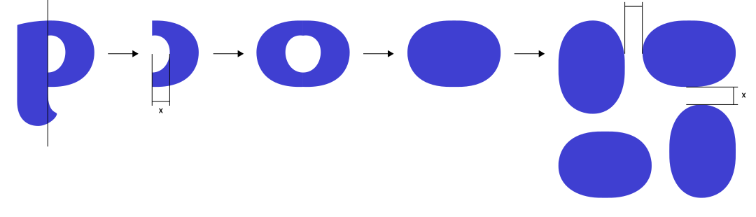
- 1. Take the P
- 2. Isolate the bowl
- 3. Close the shape
- 4. Fill it in
- 5. Repeat on a grid
Pattern in Use
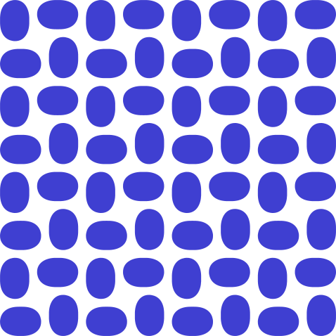
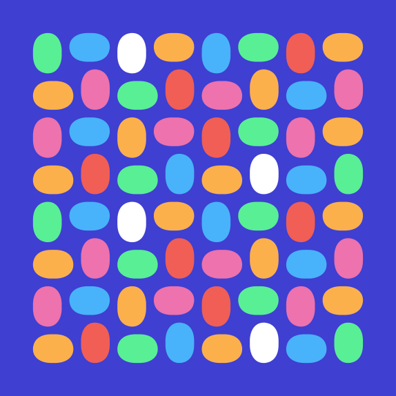
Use the pattern as a full field, as a colour block, or scaled right up until a single motif fills the frame. Keep the shapes on their grid and let the spacing stay even.
Single colour
Full palette
Scaled up

Applications
Social Media Posts
Posts combine one strong message with either photography, a colour field, or the pattern. The Logo sits in one of the five sanctioned positions, never anywhere else.


Social Media Stories
Stories carry a single line of copy over a full-bleed photograph, with a curved colour block anchoring the message to the bottom of the frame.


Thank You
These guidelines exist so that everything carrying the Pleny name looks like Pleny. If your case isn't covered here, ask us before improvising.
